The 2018 WUCC & WMUCC tournaments are over and the data is in. And yes, the overall quality of ultimate has improved.
Quality is a tricky word and requires a context for better understanding. From the spectator perspective, “Quality” is a high scoring, close game. From a team perspective, “Quality” means achieving the “Game to Score.” Spectator Quality is the more important measure. Here are the equations:
Aggregate Performance Index (API) = (Winning Score + Losing Score) / (2 x Game to Score)
Scoring Differential Index (SDI) = 1 – (“Game Diff” – 1) / (“Winning Score”)
Spectator Viewing Quality (SVI) = API x SDI
Let’s take a look at the SVI data:
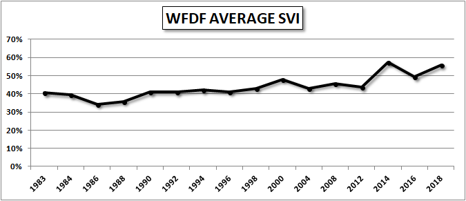
It is clear that the Spectator Viewability Index (SVI) is generally increasing over time. There is certainly some variability with up years and down years for each category, but the trend is rising.
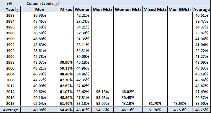
For those of you who like raw data, here’s the Pivot Table:
Some of you may have noticed that in 2014 there was a drop in the SVI. To better understand this, we need to look at another parameter, the Aggregate Performance Index (API).
Here’s the API chart:
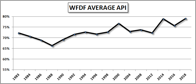
Hmmm, not what I was expecting. The drop is still there, but doesn’t seem to offer any insight.
What if we separate winning performances from losing performances?
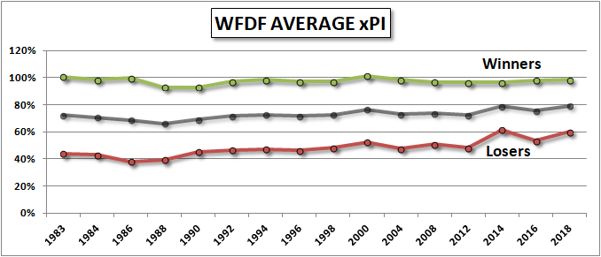
Ah, that’s better. Very interesting, isn’t it. Do you see what I see? The data shows a number of different things. There is an ever so slight decline in the performance of the winning teams from past tournaments.
In 1983, losing teams only achieved 40% of the “Game to” score.
In 2018, losing teams achieved 60% of the “Game to” score.
Conclusion
All & all, the viewability of ultimate games is improving. The improvement is due to the better play of the losing teams, not the winning teams.
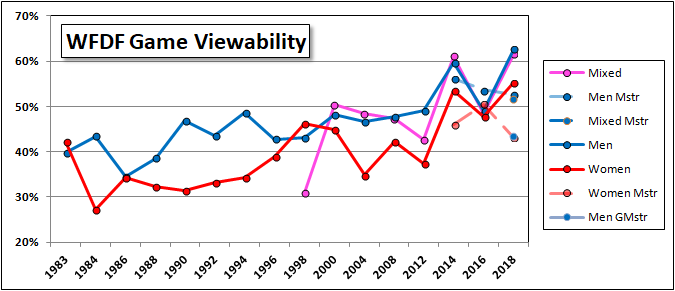
Bonus Chart
The above charts are simplified extracts from a far richer data set. I have in work an article on “Performance Differences by Team Gender” taken from that data set. Here’s one of the charts taken from the above Pivot Table:


Comments Policy: At Skyd, we value all legitimate contributions to the discussion of ultimate. However, please ensure your input is respectful. Hateful, slanderous, or disrespectful comments will be deleted. For grammatical, factual, and typographic errors, instead of leaving a comment, please e-mail our editors directly at editors [at] skydmagazine.com.